Thursday, December 29, 2011

Aqumin Volatility Newsletter 12/28/11 - $AM $AGQ

Season’s Greetings

With this the last post of the Aqumin Volatility Newsletter for 2011 I thought it would be appropriate to start by thanking my growing readership. You should be seeing more from Aqumin in 2012 as our 3D quote space starts to take off. My hope is that you found the broad market and dynamic scanning useful for trading in 2011.

Now for today, with worries about tomorrow’s Sovereign Bond offerings shaking things up, investors are taking a breather. The low liquidity is bouncing the market around as these Euro nerves cannot quite go away (even though we have seen huge drops in Implied Volatility over the last month). To end the year I will go to one of my favorite landscapes to identify unusual underlying activity, HV10 less HV30.

The data screening technique using the 3d landscape is one of the best features of using a product like AlphaVision for Bloomberg. Just set up your data space and let the landscape uncover items of interest. Color and order for this landscape are just HV10 (trailing 10 Day Historical Volatility) less HV30 (trailing 30 Day Historical Volatility). A dark green building has very active near term movement and a red building has very small near term movement. I have set that up against 1 week total return for height to see if the stock is just a one direction train or big daily moves up and down but net close to flat for the week. I have two names selected below, AM and AGQ.

12-29-2011 8-58-58 AM

AGQ is the levered bullish Silver ETF. The data print was actually bad here on the height (AGQ is not down 60% in a week) so I will pass on it. But note for many of the metals the declining price and underlying volatility. It feels like money is bailing from these metals-type names at the end of the year in a steady, sustained fashion. American Greetings (AM) just reported lower earnings and margins and they have pounded the name down on a drop. The other big drop was in SHLD (which I wrote up for TheStreet’s Options Profits). The funny thing about AM is that recent articles in the WSJ had reports of great paper sales which I guess is coming after the Nov 25th closing period for AM. Maybe this is a time to scoop up some of this stock for a nifty buy write candidate. Might make a nice present come February.

Best Wishes on 2012 and Happy New Year!

Thursday, December 22, 2011

Aqumin Volatility Newsletter 12/21/2011 - $COF

What happened to the juice?

I don’t mean OJ. I mean the juice in the options. That is what we used to call the “extrinsic” value in options. Essentially that was the premium in the options above the “intrinsic” (or parity) value of the option itself. There have been sharp declines in implied volatility (we have been showing those) in the markets and I think we finally hit a “spot”. The “spot” is where the market does not really care about Europe anymore because the ECB pulled a Bernanke and flooded the banks with liquidity. Here is how it plays out in AlphaVision™.

First we go to our Landscape of IV30 less HV60. Followers of this column know that has been the go to landscape for inflection points in the turbulent 4th quarter of 2011. The landscape below is an utter surprise since it is almost entirely red. That means the current IV30 is below the HV60 for nearly every stock in the S&P 500. There is no question now that liquidity providers are forecasting lower implied volatility going forward even with the VIX at lows for the Q4 in 2011. Also note that while implied volatilities are dropping, stocks are going up (taller buildings on the top of the landscape). The pop in stock prices this week has met with a nice drop in implied volatility.

12-22-2011 9-20-54 AM

Now for the big surprise which is the volatility crush in the Financials (see below). I am detailing the sector below because that group has been the out and out loser for most of 2011. In the Aqumin Blog of 12/07/2011, I detailed a rising from the ashes of financial insurance stocks. For stocks in the S&P 500 only Financials, Telecoms and Energy don’t have any names with a trailing HV60 trading below the current IV30. The two most volatile sectors have cooled down to the icy point. So where does that leave us?

12-22-2011 9-22-30 AM

Well it makes me want to buy financials. And to find what I want to buy I flip over the landscape (below) and only a few names were down for the last week.

12-22-2011 9-23-44 AM

Generally when volatility gets so low (no more juice!) the market is taking out one side of movement. COF (Capital One Financial) is down for the week but had a nice move up today (12/21/2011). Maybe the ECB rescue is what the market needed and we start to go higher in the boring world of lower realized volatilities. A little punch of liquidity while the politicians try to get things going, one can hope.

Wednesday, December 14, 2011

Aqumin Volatility Newsletter 12/14/2011 - $PFE, $MRK, $TEVA, $LLY

Steady Drugs

Right now the equity market seems to be discounting European News to some degree. Overall volatility levels are dropping (still nasty little swings though) for the most part and that trend has been steady since I have been chronicling it here in the Aqumin Newsletter. The market seems to want to fight upwards. On that note I wanted to mention some names that have been clawing their way up this morning.

First off I use my daily VWAP (Value Weighted Average Price) Landscape to look for smaller movement trends. Just to see if anything is jumping. Basically, a green stock on the top of the landscape means the stock is trading above its intraday VWAP and is up on the day. The position is the Market Cap (as well as size of footprint). Essentially it is showing some strength in an overall weak market like we have this morning.

12-14-2011 11-01-17 AM

Note all of the Big Pharma Names popping up. When most of the other Big Cap names were drifting lower the MRK’s, LLY’s and PFE’s had a little juice to keep it going. The next Landscape is the HV30-HV10 look at underlying volatility. What this measures is the difference in realized underlying volatility over the last 30 days versus the last 10. Note the names were just about flat for the week (closer to the landscape horizon) and red (declining short term realized volatilities). What we have is a nice slow roll till the end of the year. I think this sets up nicely for some controlled put selling (spreads) on these low P/E names using the Jan cycle. A few fund managers might have to dress things up toward the end of the quarter and these names weathered the crisis like few others. Take a look.

12-14-2011 11-03-01 AM

Wednesday, December 7, 2011

Aqumin Volatility Newsletter 12/07/20011 - $AGO, $MBI, $RDN, $MTG

Some Financials are springing back to life

As the market sits for the 4th month waiting for big things to come out of Europe (this time the day is Friday) there have been some solid trends that give some hope that the end is drawing near. As I normally do with this newsletter I am following broader volatility trends with price movement. The two go together like Starsky and Hutch. Are the moves accompanied by declines or gains in volatility? This helps in determining the quality of the move (and maybe some froth). If the names move higher on increasing volatility, to me that means folks are reaching for the options and going to the market for protection, or just a good old fashion “surprise” on the underlying movement. For the former I use the AlphaVision™ Landscape in total for broad trend and for the latter I look if there is any intra Sector activity. So what do we have this morning?

First, I will start with the IV30 less HV60 Volatility Landscape. This has probably been my most useful view the last 4 month so. Why? Because the market has been moving in lockstep and sell offs and rallies have been accompanied by wide swings in volatility. The IV30 (forward looking day 30 Implied Volatility) less HV60 (backward looking 60 Day Implied Volatility) give a window into how liquidity providers are pricing the near term month against a backdrop of last 2 month’s average movement. You see mostly red in the landscape below (red means the IV30 is less than the HV60). That has been a trend for at least a month. What you notice in the foreground for Health Care are a bunch of Dark Green stocks. These are just Biotechs and trade like this normally (they don’t do much until an FDA announcement, so the options tend to be priced higher). The big difference I have seen is the amount of Dark Red (IV30-HV60 < 10 points) names. That is increasing by a good bunch. Over all the trend of cooling is picking up steam.

12-7-2011 12-24-43 PM

Note the zoom in on the Financials below. One reason I like creating these landscapes with a movement component is to judge the quality of the move. As I started clicking around I noticed all the Financial Insurers are having a bit of resurgence from S&P ratings - do they still matter? It sure looks like the market thinks so. Also note that the group pretty much is dominating the IV30 and movement area for the Financials the last week. I think the long term prospects are pretty good for this industry (could it have gotten worse over the last 3 years) mostly as the survivors start to bounce off the bottom (AGO was the big driver but decent follow through from MTG, MBI, RDN) and start to generate money again (some might get a boost also from settlements). Given the nice levels of IV30 you can create some long delta positions just below the market if you missed the first leg of the bounce or fade the euphoria in a controlled way (read spreads) above the market. Either way some things appear to be looking better even if it was the most battered part of the market not so long ago.

12-7-2011 12-27-24 PM

Wednesday, November 30, 2011

Aqumin Volatility Newsletter 11/30/2011 - $AGQ, $ZSL

Is the market cooling down?

With Aqumin being based in Houston, I thought it would be worth mentioning that the WSJ this morning reported that the USA is a net exporter now of petroleum products for the first time in 62 years. I think that is a big deal, especially when the country is looking for symbols to pull everyone out of this anti-capitalist fog. If we could just tackle the budget issues with the same ingenuity that we now use to look for and find oil with we would be off to the races again. One can dream… The good Petrol news is one more long term reason to be bullish for sure, but unfortunately we are saddled with the volatile here and now in Europe, despite the best efforts of our native Oil and Gas Industry to right the ship. Some interesting things are starting to take shape in terms of short term underlying volatilities so let’s see how they play out in the AlphaVision™ Landscape.

One of my favorite AlphaVision™ for Bloomberg Landscapes (below) is the HV10 less HV30. Simply put this landscape reconciles the previous 10 Day Historical Volatility (HV10) with the previous 30 Day Historical Volatility (HV30) of the underlying. The landscape answers the question is the stock or ETF moving more or less over the last 10 days than the previous 30. In a volatile market environment this is important when you want to manage, say, how many calls you write against an equity portfolio. Also, I like to use this to point a direction at the broader market indexes. Are we cooling down (red) or heating up (green)? Red stocks have the HV10 less than HV30 with dark red names trailing by at least 15 points or more. As you can see below there is a lot of red and this would indicate (and confirm of late) the decline in broader market implied volatilities.

11-30-2011 9-34-26 AM

Besides the broad stroke in color, the building height is just 1 week total return for the context of a big move. Note a lot of the accelerating (green) buildings are taller or shorter to indicate extreme movement in either direction. There were only two dark green buildings in the ETF group trading over our soft screen of 15 points or more (remember the breakthrough screening technique with AV is to display above and below screened values to let the data show through). Funny enough they were the AGQ (ProShares Ultra Silver) and ZSL (ProShares Ultra Short Silver). The AGQ was sold down particularly hard (see close up below) showing HV10-HV30 at 30+ points.

11-30-2011 9-35-34 AM

From the perspective of any real moves by the big central banks (read inflation) the recent lows for the silver names seem a bit overdone. What you can ride is the accelerating underlying volatilities for more short term contracts in the AGQ (that has more bang for the buck) for a snap back. When you stretch the rubber band they tend to snap and I think the short term implied volatilities in AGQ are no exception.

Authors note: Leveraged ETF’s are volatile underlying securities and traders should use caution and spread type activities when looking at their related option products. Contact your investment advisor before initiating such trades.

Tuesday, November 22, 2011

Quoted market data comes of age

Short history-

Market data has been around as long as there has been a market. The Egyptians were using wet clay blocks to quote wheat future prices thousands of years ago. The big uptick in disseminated market quotes was the printed newspaper as soon as they invented the printing press. You could read about your daily tulip bulb prices in the Dutch Gazette in the early 1600’s. Things pretty much stayed that way until the telegraph and the advent of the electronic ticker in the 1800’s. From the outside investors’ point of view this was really the first access to the market intraday and “reading the tape” became part of the investing lexicon. Television screens came along in the guise of the Quotron terminal and now market data had a blinky, real time feel. That Quotron was still around on exchange floors until 2000 or so even when the PC (real time quotes, charts and spreadsheets) had near completely taken over for trading screens. While the markets change very fast, you will notice how slow quoted market technology changes.

Market Data Structure-

What has changed very fast over the last 20 years or so is speed of access to exchange ticker plants. It was not the quote per se but the access to it. The electronic pipes are there for everyone but some data infrastructures are bigger than others and that gives a microsecond lead in getting a quote. The Algo (programmed, automatic execution) and High Frequency Traders (HFT) now drive a large part of that order flow. And there is a continued race for speed which I will assume will end when all HFT’s can receive quotes at the speed of light. It will go back to being better instead of just faster. The problem with all of this technology is that the exchange liquidity has become fractured. As a result, we see more volatility and less concentrated liquidity except in a few markets. If market data tools are going to evolve they have to quote more information than just an uptick or a downtick.

Besides speed to market, the biggest evolution in the last 10 years is the proliferation of indexes and ETF’s and ETN’S. In general, these securities pull together like instruments to make market access easier for the trading public. The flip side of course is the markets will start to move closer together because the ETF managers have to buy and sell like securities in bulk to keep up with demand for their products. You want to trade the S&P 500? There are probably 2 dozen+ different ways to go about it- long, short, leverage, inverse leverage, you name it. The reality is that there are only the 500 names and product demand makes them mover ever closer together. If you want to find an edge, you want to see what is not moving with the market these days. Traders need their quotes to tell them more than position, they need relative position.

What is a 3d market quote?

With the advent of the various market factors of speed, fractured liquidity and increasing correlations the idea of a market quote in context makes more sense. These factors have always been in play over the last 20 years to some degree but now, as they act together, the impact feels greater in an upswing in market volatility. What is the context of a move in an individual name with the swirl of market forces around it? What is a 3D market quote?

First to describe a 3D market quote you need to understand what that represents. Below is an Aqumin Landscape using Bloomberg Data (any data point in Bloomberg is available to configure the space) to describe several real time market data points acting at once. Obviously you notice the “city blocks” with the “buildings” in each block. Each block is a user defined grouping like a GICS Sector and each building is a security which in this case is an equity or ETF. The next thing you notice is the Heads Up Display (HUD) to convey the actual market quote in the black boxes on top of the Landscape. The next, new landscape features are building colors, heights, sizes and positions. These landscape functions provide the relative relationships of the quoted data within the entire market place. You can pan, zoom and rotate in a fully interactive space. I will go into this in detail.

11-22-2011 1-30-24 PM

Height: Price to VWAP -1 this is just a simple metric that shows when a name is trading above or below the Real Time VWAP during the trading day. If the building is up above the horizon (plate), the name is trading over VWAP. If the name is close to the plates (horizon) it is about to flip VWAP position. If the name is under the plate, it is trading below VWAP. This is a relative position comparing one name with all others.

Color: Percentage Change in Price a simple representation of if the stock is up or down on the day. Green is up, white is flat and red is down on the day. You can add or change colors to create more granularity of the view. Also note that any deep (red or green in this case) color represents an ‘alert’ that the name has passed a certain threshold. This is a relative position comparing one name with all the others.

Order: Market Capitalization the relative size of each building is comparable with other buildings on one plate. Bigger buildings have bigger market caps and smaller buildings have smaller market caps. Also notice the position of each building. They shuffle and re-order in real time to push the bigger ones to one corner and the smaller ones to another corner. This is like having a quote screen with 1500 names constantly resorting for what you want to look for.

Now click on a name that catches your eye and what happens?

11-22-2011 1-32-30 PM

Since the space is interactive, you pull up a Bloomberg Chart when you click on a name and you now get a sense of what you are looking at. You have a last tick representation of a real time chart relative to all the other names. In the case above WAG (Walgreens Inc) was down on the day most (redder) for any name in Consumer Staples but not trading at the lowest level relative to its VWAP. Essentially it is starting to bounce a bit like the chart suggests. Since it is not Dark Red (an alert limit) the landscape is simply telling you that it is approaching that level. An Aqumin landscape view like this is built for momentum traders to help identify inflections prior to an alert. The 3D quoting space simply sets up an opportunity that would be near impossible to screen for. This makes the quote screen work for the trader since you just look at it and can sense unique action.

Broad quoting of volatility data

Having one view would be useful and that is how most (if not all) quote screens are set up. When you have an interactive space, you can change it on the fly and look for something else. In the sample below I want to look at a broad view of volatility data. We use the same setup for Sector plates but now we want to quote the difference in 30 Day Implied Volatility (IV30) versus the trailing 60 Day Historical Volatility (HV60). Now I use building height to show 1 week Total Return for a context layer to the volatility differentials. If a building is red, the forward IV30 is trading at a discount to the prior HV60. If a building is green, the name is trading at forward premium. So what do you do with this?

11-22-2011 1-33-46 PM

In this case of about two weeks ago the market was signaling lower volatilities moving forward based on IV30. The absolute level of current IV30 is sufficient to price the moves forward. Even with the market going south from the Euro Issues on the week of November 14th the VIX actually declined. In this case the Aqumin Landscape was a predictive indicator when looking at Broad Quoting Relationships offered in the view. The idea here is not just reading a chart but looking at many charts at once to come to conclusions about market volatility behind the broad indicators. The movement behind the movement is now possible with better a better way to view the market.

Looking for opportunities

What we have now is a new way to make decisions with the market data we already have access to. The uses moving forward are really two fold for this type of quoting technology:

1. Find the chart or name that looks interesting out of the sea of market action. That name should come to the user.

2. Use the aggregate of quotes in context to make assessments on the relative market indexes (like the VIX) or ETF’s based on the underlying group of securities that make up the larger bucket.

As traders we are always looking for edge. The high speed area of the market is in a high stakes race for technological superiority that most of us just watch. By reorganizing market data in visual space traders can wait and look at the wreckage to see if anything is worth doing. Much better to wait for opportunity then get run over in race beforehand.

Wednesday, November 16, 2011

Aqumin Volatility Newsletter 11/16/2011 $AAPL, $NLY, $AGNC

Are Financials still leading the way?

Headline news this morning has the Super committee in Congress already looking to fudge their debt reduction pledges. Maybe they don’t have CNN and are not watching what happens to countries when they don’t get their house in order. Two leaders in as many weeks were brought down by the bond market. Yes, that is right. Not by voters, but a bond market that is flexing its muscles. Sort of like the Arab Spring for Euro Leaders addicted to debt. Congress can change its mind (one can hope) but I think you can see the unease in the equity markets. Let’s look at some individual volatility for the most active Equity and ETF option classes.

First I have a wide view of 30 Day volatility in the AlphaVision for Bloomberg Landscape. Any name in dark green is trading over 40% 30 Day historical volatility (HV30) in the underlying and dark red is under 20%. Building Height is HV30 also to add some granularity to the view. Building footprint is market capitalization. You should see fatter buildings tend toward red in color since higher market cap stocks tend to trade at lower HV30’s. Note the relatively higher HV30 for AAPL in the lower left corner.

11-16-2011 9-41-30 AM I use 40% HV as a soft screen indicator. When the market is more benign most of the bigger market capitalization stocks trade around 20% HV30. 40% HV is a double and good place for me to review broader market activity.

11-16-2011 9-43-24 AM

Just zooming in to the Financials and Materials (gold and miners) I see very few stocks with lower HV30’s. Both of those Sectors really show the strain of what is going on right now. Normally I see more red in both those (lower HV30) and I am seeing almost none now. Before I can believe any rally in the overall market, these colors have to change to at least light green. Financials and Gold Miners need to become somewhat boring and that is just not the case. In the Financials, there are just a couple of high yielding REITS (NLY and AGNC with current dividends well over 10%) with lower HV30. These REITS were trading at 40%+ HV 30 at the height of the crisis this summer and have come back a bit. Now that the Fed has signaled lower rates into the future these might be worth a look (I own NLY in an IRA) at a very depressed price (think stock with a collar for now). They are trading cheaply and I think a big part of the reason is the instability in the bond market. The bond market has already shown its willingness to push for change; I just don’t want it to happen on this side of the Atlantic.

Wednesday, November 9, 2011

Aqumin Volatility Newsletter 11/09/2011 - $EUO, $SMH

Italian Bonds a bargain at 7%?

As the markets open this morning with things looking lower we cannot seem to get away from the headline news. Italian Bonds cleared the 7% hurdle now so they look to be on a path toward unsustainable interest payments in the future. I think most investors in the debt world are worried about what they are going to get for what they own now. You think the Super Committee is taking note of this as we plunge inexorably toward the same sovereign debt structure as the PIIGS? Great, we can be just like them. The market did seem to signal this so let’s take a look at the AlphaVision™ Landscape for the close on November 8th, 2011.

Originally I was looking for positions to sell options in. When I open up the AlphaVision™ for Bloomberg Landscape I saw something I don’t normally see. Color in this case is 30 Day Implied Volatility less 60 Day Historical Volatility. All the red you see below are stocks that have December volatility trailing the underlying activity of the last 60 Days. As you can see most of the active option classes are red and I cannot sell too many options into that. But I think this is telling us is that options are pricing forward movement lower than the past two months. 7% yields in Italy or not, the market is pricing lower implied volatilities.

11-9-2011 10-14-30 AM

The close up below is of the SMH (Semiconductor HOLDERS ETF) and EUO (ProShares UltraShort Euro ETF) ETF’s. Note how the market is pricing almost the entire ETF complex for a slowdown (read red) in Implied Volatility. The top two that bucked the trend (Dark Green) are the SMH (which I discount because of wide markets) and the EUO for higher volatility looking forward.

11-9-2011 10-15-51 AM

The higher EUO volatility differential rightly thinks the Euro mess is still rolling but I think we start to see less effect on US Equities than over the last two months as the real exposures to this mess unfold.

Wednesday, November 2, 2011

Aqumin Volatility Newsletter 11/01/2011 $FAS,$FAZ,$ERY,$TZA

Buying PIIGS Sovereign Debt is like what?

One of my own favorite posts lately was “Flaming Cheese”. At that time I was looking for trades as the whole Euro mess started to cool. At this point I have lost count on how many times the market has taken the Implied Volatility straight up only to crush it back down a week or so later. This is easy money, right? Well maybe not that easy. Just ask the guys on the prop trading desk at MF Global. Down goes another firm but the market really did not care much. I think that loading up on European PIIGS Sovereign Debt right now is like selling Implied Volatility at the bottom. Sure you have a chance to win but you can get killed by the swings in the meantime. Let see how the current short term Implied Volatility scene plays out in AlphaVision™.

Below, my AlphaVision™ for Bloomberg Landscape is monitoring 10 Day Implied Volatility (IV10) less 30 Day implied Volatility (IV30). If there is a spike in near term Implied Volatility the building (a stock) is green and my target value of 15 points over registers in dark green. Any name showing a decline registers in red and dark red for 15 points or more to the downside. Building height is One Week Total Return (up is positive) to give the volatility moves a frame of reference. We see a lot of green as the market took the great Greek bait and switch in a “not so positive” way. I left the sector plates clear so you can see the short term moves in Implied Volatility in the 800 or so most active names. That action was nearly all up.

11-2-2011 11-07-44 AM

I adjusted the plates to opaque, so we can focus on the dispersion of names on the “up” side of the landscape. There are still plenty up after two good days of selling.

11-2-2011 11-10-13 AM

I do like poking around the ETF’s for signals. While most of the market has higher shorter term (read Weeklies and November) implied volatility over the last couple of days, the opposite ends of the spectrum in the ETF’s were interesting once I checked them out. On the big volatility pop I see the TZA (Direxion Daily Small Cap Bear 3x), FAZ (Direxion Daily Financial Bear 3x) and FAS (Direxion Daily Financial Bull 3x). The one strange thing was the FAS showing up 36% for the week which I think is a data error and should be flipped down (more like down from $16+ to $12.56 for the week). With such a big move in that in both IV and absolute terms I am looking at that name to start overreaching on the downside. On the other side the ERY (Direxion Daily Energy Bear 3x) was showing just lower 10 Day Implied Volatility from the IV30. The name is climbing out of the basement so no real surprise the IV10 is drifting lower than the IV30.

11-2-2011 11-11-42 AM

Overall my takeaway here is to wait. I don’t see much that is conclusive except the financial ETF’s (and by proxy financials) probably overshoot Implied Volatility levels in the short term on the Greek Referendum news. If the referendum is in January the short term picture should start to fade a bit and it might be better to wait to jump on the decline in IV10. As opposed to MF Global, waiting will get you better prices for the short premium positions so don’t take the bait quite yet.

Authors note: Leveraged ETF’s are volatile underlying securities and traders should use caution and spread type activities when looking at their related option products. Contact you investment advisor before initiating such trades.

Wednesday, October 26, 2011

Aqumin Volatility Newsletter 10/26/2011 $MCD, $GE, $HPQ

Will Market Volatility cross the “Line of Death”?

With the cash VIX (CBOE Volatility Index) closing below 30 on Monday on a nice rally the question lots of pundits are asking is if we are going to break through to the low 20’s on the “Fear Index”. As for now, 30 seems to be the “Line of Death” (could not help the Gadhafi reference from the mid-80’s) for market volatility as measured by the VIX since the market can’t get past it on the downside. What I would like to do is unpack some of the individual name volatilities that make up a part of the S&P 500 and see if there is a trade or trades that fit the 30 handle inflection on the VIX. Since the VIX seems to bounce off of 30 you want a long Vega trade for the Euro Meltdown threat but also a short Vega trade to help if the Euro scene starts to normalize (we can only hope) and storm through the VIX “Line of Death” like the late, great RR.

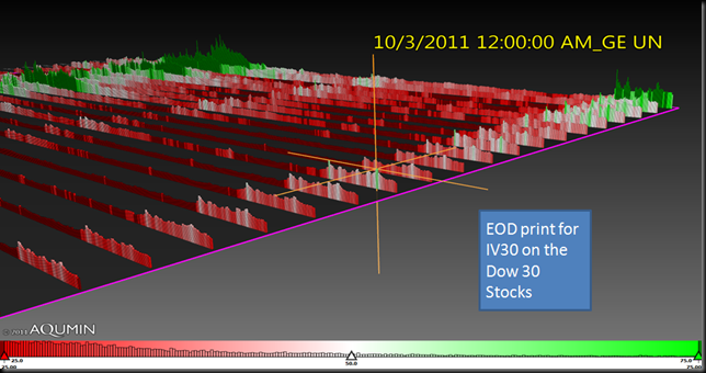
For this job I use AlphaVision™ for Excel and Bloomberg Historical Data. I simply load data into Excel and create a Historical Time Series Landscape in the View Manager (just select the date range and hit “Create”). I am going to pick a relatively small data set of the S&P 500 using the Dow 30 stocks and layout the 30 Day Implied Volatility on the close of each day. The hard thing of course is trying to convey movement in static screenshots. Either way the dark red end of day prints show 30 Day Implied Volatility (IV30) below 25%. IV30 is the 30 day forward price of option implied volatility. Notice as you move to today’s date, the very last print, the colors change over time. That is just a different reading of the30 Day Implied Volatility data (dark red <25%, white= 50%, dark green > 75%). Prior to the USA downgrade, much of the Dow 30 traded at 25% IV30 or less as noted by the rows of dark red buildings. A sure sign of lower volatility is well, lower volatility, and about 1/3 of the Dow is getting back to more quiet levels with a bellwether name like MCD down to 20.35%

10-26-2011 9-58-34 AM

Let’s tip toe down the Time Series Landscape (below) until we see some green (50% and above IV30). The idea here is to find a name in the Dow that has the ability for IV30 to “jump”. That first name I see is GE and the current IV30 is down to 29%. GE has a substantial financial component and is now nowhere near the 62% IV30 of a few weeks ago. This probably could go a bit lower before GE interests me from a volatility point of view but it is getting close. I like to know, if the volatility hits the fan again, where that GE juice will go (look at the green spike). Let’s call this the buy side of the volatility equation and mark it. GE just reported earnings.

10-26-2011 9-59-58 AM

Now we go to the higher end of the IV30 scale (see below) and we find HPQ. The two higher valued IV30 stocks in the Dow are BAC and AA. Neither really fit with what I want here (BAC is out of category, AA is not rich enough). I want to sell some relatively higher priced IV30 to balance the potential GE volatility purchase somewhere else. 45% IV30 is not too bad for HPQ in an off earnings cycle for a 1 month trade. HPQ is down in the basement as far as stock price with a 5.5 P/E so most likely it would be selling put spreads into the weakness we had on Tuesday. The combination of bidding into IV30 softness by buying puts in GE and selling some controlled downside in HPQ would balance the “Line in the Sand” area we see in the VIX. A big move in implied volatility and the combination should be ok. Maybe even squeak out a few bucks.

Authors Note: Selling and buying options in unrelated issues will cause heavier margin requirements and carries substantial risk. Please consult your investment professional.

10-26-2011 10-01-08 AM

Tuesday, October 18, 2011

Aqumin Volatility Newsletter 10/18/2011 $HAL, $SLB, $FTI, $NOV, $WFC, $CME, $RF

What group is acting like the Financials?

There is lots of talk about correlation in this market. As in much of the traded equity world is moving in the same direction at the same time. Some blame ETF’s, EuroGloom, High Frequency Traders, Bad Policy, etc. but I think it is probably a combination of those things. On any given day since early August there seems to be only one sell or buy button and everyone jams it at the same time. So I thought it would be interesting to look at the frequency of the movement over the last week and draw some conclusions about two disconnected sectors, Energy and the Financials.

The next series of Landscape Snaps from AlphaVision™ for Bloomberg show the S&P 500 with building Height 1 Week Total Return (tall buildings are up on the week). The Color field is 10 Day Historical Volatility (HV10) less 30 Day Historical Volatility (HV30) so stocks moving with higher HV10 will show up in green and lower HV10 in red. I left the Sector plates clear so you can see which stocks are up/down and have a clear sense of the underlying volatility. Also, I arranged the plates in order of Average Total 1 Week return so the Sectors in the lower left have the highest average performance over the last week. As a reference point S (Sprint Communications) pulled up the Telecom group so that would make Energy the solid #2 performers for the week. EP (just taken over) is the reference HV10-HV30 volatility point in the Energy Group.

10-18-2011 2-26-31 PMThe Red Buildings on the top of the landscape (detail below) means that past week’s strength in Energy came on declining near term underlying volatilities. Except for a few Oil Services names (HAL, NOV, FTI) on slightly higher underlying volatility for the most part it was up, slower for this group and the #2 position for the week. I like it when a group within a group gets picked on like the Oil Services while the world just lit up for Natural Gas.

 10-18-2011 2-28-08 PM

If you hop to the back of the Landscape the low end of the scale sticks out for the Financials since it is mostly green. Here the movement has been increasing in the short term, even with what was until yesterday a solid upswing in the market. The relatively weak performance on higher (greener) underlying volatilities generally is not a good sign. Think get me out, faster. The Financials were very much counter to the declining volatilities in the market as a whole and as group I think I am going to stay away for a bit. Possibly the revenue pictures going forward are pulling things down. Either way the action is too one way.

 10-18-2011 2-30-22 PM

Going back to the Oil Services vs. the Financials thought, I don’t think the picture is as bleak as this pre-opening Landscape Snap looks for the Oil Services. HAL has not produced a quarter like the just recent since 2008 which was a record revenue year. Maybe the slap was too hard and it might be time to take another look. I can’t throw the Oil Services into the same boat as the Financials even though the market movement appears similar. I can dig that.

Tuesday, October 11, 2011

Aqumin Volatility Report 10/11/2011 - $NFLX, $S, $CLF

When Momentum Stocks Die

As an owner of stocks I just love the blowout rally that we had on Monday. The problem of course is the 1000 point drops in the Dow Jones Industrial Average just prior to this spike. I would be happy to say the Euro Zone problems are done, I cannot just yet. It looks better on balance over the weekend as Euro TARP is on the table but the general illiquidity is still a bit of a mess. Yesterday’s closing AlphaVision™ Landscape view told an interesting story, so I thought it would be worth describing. I think we saw the death of a once great momentum stock (although it had been quite sick), Netflix.

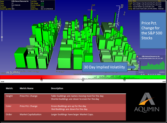
My quote screen is the view I call the AlphaVision™ Ticker (AV for Bloomberg). Height and Color are the Percent Change in Price and the Building Size is Market Cap. Also, note the chart on the lower right which is my 30 Day Implied Volatility (IV30) measure using Bloomberg Data. You can watch as many names as you want (up to 600K with the new 64 bit AlphaVision™) but here I am looking at the S&P 500. Good Euro News and “Bam!” like Emeril every stock flies. Talk about correlation. Notice that CLF was the best performer yesterday and note the volatility chart in the bottom right (Materials bottoming?). The name is peeling off of recent IV30 highs and that is the kind of momentum I want , if looking for more upward movement in the underlying. With declining IV30, the forward indicator is forecasting less movement.  I read that as some of the severe downside is taken out of the mix for this Materials name.

10-11-2011 10-17-41 AM

When I taught option trading to newbie floor traders, showing opposite ends of the spectrum was always helpful.  AlphaVision™ makes this easy because you just flip to the other side of the Landscape (see below). There lies the very sad NFLX and S.  (I will save S for another post.)

10-11-2011 10-20-34 AM

Clearly on a day when you just had to breathe to be a gaining equity, NFLX wheezed to another decline. But also note the uptick in IV30 on the chart in the lower right. The market is saying this movement is not quite done. That could screw up some call spread sellers if the IV30 continues to tick up even as the stock continues to decline. In general I would rather initiate a position after the name has shown a reversal in IV30. NFLX had a solid 18 point or so range on Monday after the nice rally in the morning and the IV30 is still on an upward arc, clearly jacked from the reversal. The Death of a Momentum Stock is an ugly thing since long holders quickly run out of reasons to own it and there is no real fundamental basis for the lofty value (see Crash of 2000). As a Momentum Name NFLX looks dead but this does not mean the management can’t pull itself out of the current (self-inflicted) tailspin. I am not ready to catch this falling knife yet.

Wednesday, October 5, 2011

Aqumin Volatility Newsletter 10/05/2010 $ZSL, $EDZ

“Juice Fatigue”

Average folks have a singular concept of market volatility. CNBC talks about the VIX (the CBOE Volatility Index) and the “highness” and “lowness”. Without going into too much VIX detail, lower VIX numbers measure relatively benign market conditions (20 or lower) and higher VIX numbers (21 and over) show more volatile market conditions. As I write this morning the cash VIX is 40.89. Quick and dirty we are at least 2x any “normal” market. But what is important for anyone who trades options is how the market is valuing that number. And this is a case where AlphaVision™ with a Bloomberg Terminal helps quite a bit.

First I a select the view with a time frame of interest, which in this case is IV30 less HV60. Here using the forward looking IV30 helps paint a smoother picture. I pick the trailing 60 Day Realized Volatility (HV60) to highlight the last two months. Note all the green in the landscape. Dark Green buildings show IV30-HV60 of at least 10 points. The building heights are 1 Week Total Return so any building standing up was up for the last week. The market is pricing most issues at a steep premium to just recent, and volatile underlying activity. I note the EDZ and ZSL as names up a lot for the week with a very rich IV30 premium to trailing HV60. I will circle back on those in a minute.

10-5-2011 9-42-16 AM

The real power of using a Visual Space is you can compare things in a broad way. The Mind’s Eye is a powerful thing. If you recall from my “Flaming Cheese” Newsletter of two weeks ago (same screenshot below) the market looked much different. You can see from the AlphaVision Landscape a Sea of Red as opposed to a Sea of Green today. Same exact market measures but liquidity providers were marking down most implied volatilities sharply. Not so anymore as they are pushing premiums up to account for more movement in the future. I see this sharp flip as pricing in a big move, most probably the Greek Default.

10-5-2011 9-43-53 AM

It is very hard for premiums to stay at this relatively high level since we are both at higher underlying volatilities and higher absolute implied volatilities. This creates a gravity pulling premium down but no one really willing to sell options because of the Euro problems. I have always called this “Juice Fatigue” (“juice” being floor slang for option premium) and it happens from time to time in our markets (just not to this extreme) and it is darn hard to make money in an environment like this. Now you know why. So you pick your spots.

Now for a close up on the star performers of the week as both the ZSL (ProShares Ultrashort Silver) and the EDZ (Direxion Emerging Markets Bear 3x) were the top performers on the 800 or so most actively traded names. The big question is do you fade the rally in both of these? Having the short term market leaders as inverse metals and emerging markets ETFs with near the most overvalued premium gives me reason for pause. How long can they keep this up? To take advantage of “Juice Fatigue” you have to be selective. Anything done in these names should be executed via spread only but key outliers are a nice place to start. Keep an eye on both these inverse ETFs and see if both the implied volatility and price sag. Maybe gravity will finally start to work (and the Greeks default and get it over with).

10-5-2011 9-45-02 AM

Authors Note: The market is very volatile right now and both of the ZSL and EDZ are 2-3x more volatile than most stocks on average. Exercise extreme caution when trading these names.

Tuesday, September 27, 2011

Aqumin Volatility Newsletter 09/27/2011, $WAG

How to find a WAGging dog?

For the last few weeks I have been mentioning Euro Zone issues and some of the specific highlights in market volatility, especially around some of the outliers in the metals (Flaming Cheese, OPA!). More whispers of EuroTARP have filled the air and all the bulls came out storming. But even as I write this today, things are already starting to fade and maybe because the Euros have not really solved anything yet. I want to highlight a more mundane market activity, an earnings announcement, and see if there is something to all of this broad market quoting, especially when you look at relative relationships. And I will throw in a small volatility observation to boot.

AlphaVision at its core is a 3D quoting screen (using market data of course). It does what a normal quote screen does, but as my 4 year old daughter would say it does it “betterer”. How so? Simply, the landscape helps generates ideas. In the AV for Bloomberg Equity Landscape below I have my normal market quote view. This little gem was put together by Jason Javarone, our VP of Solutions and we call it Real Time VWAP Deviation. Essentially you are looking at multiple lines of 1500 different charts at once (for the S&P 1500). There were not many Big Cap stocks down at the time this morning so WAG caught my eye. The building height is [Price to VWAP-1] which just means the buildings sticking up (I have the landscape flipped over) are trading below their Value Weighted Average Price. The Color of the Landscape is Percentage Change in Price (quote “fatness” is Market Capitalization) so the embedded Bloomberg Chart is showing WAG down for the day (red) and trading below WVAP (note the last tick position in the chart). The AlphaVision buildings are just the “last tick” for the data points selected. For whatever reason, the market did not like Walgreens (WAG) earnings even on a very green day.

9-27-2011 11-29-10 AM In the second screenshot below, taken about 20 minutes later, you will notice many more buildings moved to the WAG side of the landscape horizon. The stocks are still up for the day but peeled off of their highs and many were trading below their VWAPS. Just looking at the Consumer Staples plate it is very clear. WAG barely moved. I read this relative activity as the money that moved in for the earnings pop has already left the building (no pun intended) and when the market started to sell off a bit WAG held up. This is good for the name and with Implied Volatilities more toward the higher end of the spectrum, WAG here (with the market action), makes a nice entry point with some short put spread-type trades or In the Money Buy Write. The market dog is not WAGging this one, and for now that is a good thing. Might be worth a look.

9-27-2011 11-30-57 AM

Tuesday, September 20, 2011

Aqumin Volatility Newsletter 09/20/2011 $EUO, $GLL

“Flaming Cheese”

Back in the 1990’s when I was a floor trader on the CBOE many a celebration was held at Greek Islands on Halsted Street just a hop away from the exchange. As soon as you get there the waiters would fly in with bottles of Retsina and plates of Taramosalata (we called it “Fish Whip” and it is delicious) and Saganaki (“Flaming Cheese”). It was (and still is) a great time with great food swapping stories of big wins or crushing defeats. The Greek Default problems are like my plate of flaming cheese in the old days, once very hot and now starting to cool. Let’s see what the recent cooling off looks like and if there are any tasty bites.

9-20-2011 9-33-22 AM

The key here is picking the right time frame to examine. I choose a simple landscape of IV30 (the forward looking 30 Day Implied Volatility) less the HV60 (the backward looking 60 Day Realized Volatility) for Landscape Color and Order with Landscape Height 1 Week Total return. This way I can see if a volatility opportunity is bound to a recent move. The AlphaVision™ Landscape above is mostly a sea of red (around 70% or so) for the most active 800 names that trade options. This means the liquidity providers are forecasting lower volatilities going forward than the last 60 days. No surprise but still it is a substantial part of the market for equity and ETFs. Simply, the forward looking volatility is trading at a discount to the realized volatility of the last 60 days. While that is the trend in red, I want to explore a couple of the names in green (which means forward IV30 is trading at a premium to the HV60 over the last 60 Days). This is the “Hot Cheese” on my plate.

9-20-2011 9-35-03 AM

First I zoomed into the ETF’s since I saw so few dark green names. My hard cutoff was 10 points over (IV30-HV60) but as you can see AlphaVision™ screens for all available names. I kept it to stocks just moving up over the last week since I wanted to take sudden drops out of the picture. First up (on the upside) is the EUO (Proshares UltraShort Euro ETF). The market is saying the name is going to move more than it has in the recent past. With the Euro Zone a mess, I cannot disagree. The next name was the GLL (Proshares UltraShort Gold ETF). This name has popped up in different guises in my past blogs. First the GLL was super cheap (volatility-wise that is) then the realized volatility exploded (two + weeks ago) and now the market has gone full circle and is pricing the IV30 at a premium to its last (very volatile) 60 days. This is now in the face of gold not making new highs anymore. While I am sure we have one more spike in gold at some point when Greece finally caves and defaults, it does feel like the big upside is starting to come out of the picture and paper is driving up the price of options in the short term for this inverse gold contract (GLL). Maybe a short term, short put spread-type play is in order here (maybe even a covered call since GLL is so close to its 52 week lows). This is either a trade small or add to watch list situation (you could wait for the spike and fade the move then), but the October cycle looks like an opportunity. But you should understand this contract is priced like this for a reason (meaning risky). If we get more of the same wishy-washy action out of Europe, look for this GLL premium to compress in the short term. Much (but not all) of the “flame” is off of the Euro “cheese” plate for now, except in select locations. OPA!

Author’s Note: Inverse, levered ETF’s need special care for risk and require special margining. Consult your investment advisor before making any such transaction. If you don’t understand it, don’t trade it.

Tuesday, September 13, 2011

Aqumin Volatility Newsletter 09/13/2011 $INTC, $TSL

Chips and a Dip

I don’t think I am going to bother mentioning all of the bad Euro News. It just seems to be the same although we did get a small lift from sadness when rumors of Chinese buying Italian Debt surfaced. I can see the Chinese buying Italian cars, clothes and art but their debt is at the bottom of my list. Just one more reminder of how sensitive equities are to whispers of Euro News. I liked it better when we had left Euro trouble in the 20th Century. Not all things are going horribly in equities so let’s take a look at the changing volatility landscape as of the close Monday.

First, as this is Expiration Week, I thought I would set up an Aqumin Landscape of 10 Day Implied Volatility over 10 Day Historical Volatility for a ratio of short term action coming into the final week of the cycle. A Dark Green Building has the ratio of IV10 TO HV10 2x or higher. The market is pricing significant moves for this week relative to how the name is actually moving. Also in the screenshot below Height is 1 Week Total Return (inverse) so taller buildings are down most for the week. I thought the Semiconductors stood out as the higher short term implied volatility had a reason to be elevated since the group (and on a couple of clicks turns out to be the Solar Semis) tanked this week. A name like TSL (Trina Solar) at >5 P/E seems to be the poster child for the sick sector.

9-13-2011 10-53-38 AM

A high profile US government backed bankruptcy in the space did not help the Solar Semis as they got pushed to lows for the year. Although the pricing is tempting in terms of elevated Implied Volatility there are too many overseas ADR’s and flim flam to take any real risk (ok maybe a little) in the group yet. The nice thing about surveying market data in AlphaVision is you can keep looking. Just flip over the landscape and zoom into the other side of the Semi story.

9-13-2011 10-55-19 AM

If you take out the Solar Stocks, the Semi’s did quite well in a pretty ugly week. They might have been the best performing Sub Industry if not for the collapse in Solar Chip stocks. While there is not as much short term edge in the volatility pricing as the Solar Semis, there is some decent edge as the market underlying volatility continues to cool (albeit slightly). Maybe this is the bounce in Semiconductors that is for real this year. At least you get some nice short term entry points in the Blue Chip Semi Chips. Have your Chips after the dip, as it were…

Wednesday, September 7, 2011

Aqumin Volatility Newsletter 09/07/2011 $GLL, $UGL

Have we seen this before?

Sometimes I yearn for the good old days. I think I am old enough now to look back 15 years or so and fondly remember when a crisis or bubble had a beginning, middle and an end. The USA invented Brady
Bonds for Latin American debt in the 1980’s, fixed that. The Mexican Peso crisis in the mid 1990’s was mostly a collapse in the price of TMX (at the time one of the biggest traders on the CBOE) and Treasury Secretary Rubin (he handled the 1990’s flare ups rather well) rode to the rescue on the currency with guarantees. Brazil had inflation issues but moved to fix them with substantial policy changes. We had a great Biotech Equity Bubble in 1991-1993 when no one would buy a stock that made real money. The Asian Currency crisis in the late 1990’s help set up the current prosperity of today in that region. It was a good lesson that you don’t want to borrow too much in another currency and should make subsequent policy adjustments accordingly. The point for our current market volatility is that still, a year or so in, there are really no substantial policy adjustments in the Euro Zone (PIG austerity?) that market participants are buying. Let’s see how that play’s out in the market’s underlying volatility right now.

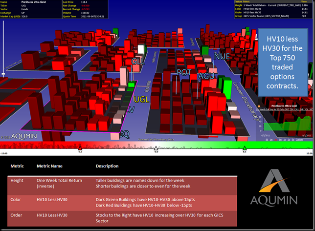
One thing I like doing is using simple arithmetic setups with different volatility measures to get a sense of what is happening behind the bigger indicators. In the AlphaVision™ Landscape below running on the Bloomberg Terminal I have set up a landscape using 10 Day Historical Volatility (HV10) minus the 30 Day Historical Volatility (HV30). If a name is moving more over the last 10 days than the last 30 days it will show up in green on the right of each GICS Sector. Building height is the total return for the week (up is negative in this case) when I pulled up this 3D quote screen Tuesday afternoon.

9-7-2011 9-25-35 AM

The first thing you notice is the Landscape is mostly red for the 750 or so names that trade 500 call option contracts or more. This means that the HV10 is less than the HV30 for most of the active listed names that trade options. As I commented last week, the crisis is slowing down in terms of Historic or Realized volatility recently but still near the peak of last year. What surprised me was that so few names had accelerating HV10 yesterday and barely a handful had HV10 15pts higher than HV30 (which is a level through observation I like to note). For the ETF group, both the UGL (ProShares Ultra Gold) and the GLL (ProShares UltraShort Gold) had rocketing levels and were leading ETF’S and very near 15pts higher. If I had a hard screen at 15pts, I would have missed these names using traditional screening techniques.

Now what does this mean? With the two levered Gold ETF’s leading the uptick in HV10 money is concentrating in these underlying contracts even more, pushing the Realized Volatility levels around. The gold trade is even more so the on again, off again way to manage risk for the average investor and the underlying volatilities are starting to show it. Euro Crisis solved gold in the tank, Euro Crisis on more of the same and higher with more Realized Volatility. Tough to believe we have turned gold into an early 1990’s Biotech stock but it is starting to trade that way. Almost 20 years later, same crazy activity but different names. Who knew?
Monday, August 29, 2011

Aqumin Volatility Newsletter 08/26/2011 $BAC, $HPQ, $JPM

“You were always on my mind…..”

Ah the sweet sounds of Willie Nelson. Not so sweet is the mess we have following the S&P Downgrade of US Sovereign Debt. After a one week layoff in posting, although I do look at the market every day, there is plenty to look at in the aftermath of the downgrade. I am going to call this G7 (lump in the USA now) Debt problem, for however long it lasts, the New New Era. As opposed to the New Deal which saw a contraction of credit (after the Crash of 1929) and expansion of fiscal stimulus, we have an expansion of credit and fiscal stimulus. The New Deal was not kind to stocks, but great for government bonds as the real yields plunged to negative numbers (sound familiar?). The difference is after the 2008 Crisis we got lots of credit through TARP and various monetary pops from the Fed. No doubt Fed policy makers learned from The Depression to keep the money taps open. I think the problem now is Europe did not go through the serious bloodletting that the USA did in 2008. Besides the US debt downgrade, not much has changed in the last 3 weeks or so (not that the debt ceiling resolution or other economic news has been that great). Let’s examine 10 Day Realized Volatility during the era of New New to see what we can see.

First here is a short primer on the Financial Crisis of 2008 and 10 Day Realized Volatility. In the Aqumin Time Series Landscape below the Dow Jones Industrials are laid out like standard bar charts side by side to read an actual volatility impression of the market. Time is moving from January of 2008 on the left to today (just out of sight). It is easy to pick out outlier patterns like this. Dark Green bars are over 80% Realized Volatility for the previous 10 Days. White is near 50% and Dark Red is below 20%. The Financial Crisis in 2008 is pretty easy to spot. Note that it was really two, 3 month periods of extended volatility. BAC topped out at about 311% 10 Day Realized Volatility when things got really nasty.

 8-29-2011 9-22-36 AM

Also note how Realized Volatility collapsed as the financial crisis tailed off. Stocks stopped moving while market participants scratched their heads as to what was going on. The next phase of the New New Era is last summer’s meltdown from Greece and other higher risk nations in the Euro Area.

 8-29-2011 9-24-45 AM

I have a Money Center bank like JPM topping out around 56.45% for a 10 Day Realized Volatility. If you note the Dark Red area just to the left of the JPM flag, 10 Day Realized Volatility was very low and that Euro Crisis was about a double on average for the 2 month span of higher numbers. The Euro band aid and QE2 seemed to hold things together as volatility in the Dow receded a bit.

Now we get the S&P shocker below which I believe added the US officially to Sovereign Debt pile in people’s minds. Notice the giant spike in 10 Day Realized Volatility as the market literally melted. Stocks might climb a wall of worry but they fall off a cliff in a panic. As of today we are about 50% off of the 10 Day Realized Volatility highs of early August but near the same level as the peak last summer as you look across the DJIA stocks. Just compare the relative levels now with the picture above. I have JPM highlighted at around 47.735 10 Day Realized Volatility. Also note the last few days as most of the building are inching back up. The leader in the corner is HPQ (after trying to get out of the personal computer business and feels a lot like IBM in the early 1990’s) and next comes BAC. BAC now has the Berkshire Hathaway put going, and while I can’t pretend to know how Mr. Buffet operates, that BAC Preferred Stock purchase might be a subtle way of Warren telling the President, “Leave the banks alone, we still need them!”

 8-29-2011 9-26-11 AM

Now back to Willie’s song, You were always on my mind. The market volatility is coming from policy problems the G7 governments can’t seem to fix, which is how I read this Time Series Landscape. The tools are there but the politics and problems linger and having the USA tossed into the mess brought things from the back of the mind to the sell button. JPM seems to have slowed down a bit and is trading well under the 10 Day Realized Volatility of last summer. I think a little less relative volatility means a more stable outlook and you might want to selectively sell, controlled long bias type option premium in there. HPQ will have a hard time seeing 10 Day Volatility get much higher than it is right now and you can trade that accordingly. BAC has the Buffet put on so it is probably not going out of business even though the market priced it that way 5 days ago.

Sovereign Debt worries are on my mind, so I don’t do anything that big and wait for the next shoe to drop in our New New Era.

Tuesday, August 9, 2011

Aqumin Volatility Newsletter 08/09/2011 - $CAT, $BAC, $MCD

Put a Collar on your CAT

As I write this volatility report, I realize the Equity Markets have had what psychologist must dub a Nervous Breakdown. Where things were already on a knife edge and some event comes along and the mind falls apart. I view the S&P downgrade as something like that. There was thin confidence in governments of late and now someone said they need to get their act together. This was a surprise? Imagine if S&P did this in 2006 with Mortgage Backed Securities? Congressmen would have screamed at them for killing the American Homeowners dream. Either way, Sovereign Governments will have to spend less (or better collect revenue) because economies only generate so many dollars. The Politicians should thank S&P for giving them cover to do the
$1 Trillion per year in cuts that is needed. The change in spending alone will give the patient (market) the confidence it needs to get rolling again.

So what did this do to market Implied Volatility? It went through the roof and you don’t need a 3D Landscape to tell you that. When the S&P 500 moves at 5% per day, the VIX is going to soar and stocks are going to move in lockstep. So let’s go back in time to 2 or so weeks ago, prior to the breakdown and perform some hypnotherapy on the Dow and see what we see.

Anyone with a Bloomberg Terminal or a decent downloadable data feed can run AlphaVision™ for Excel. This chart setup is an expanded Time Series unique to Aqumin and provides a new way to chart market data. I have loaded the Dow 30 stocks in rows and measured the relative performance of each name. The Green Spikes are a 45% over performance and the Dark Red spikes are 30% underperformance. The rows are ordered by the relative performance starting from best (to worst). The best was CAT and the worst was BAC.

8-9-2011 9-42-39 AM

At this point you say big deal. I can see that in my Dow spreadsheet. Even if you did not know CAT was the Dow leader this year, BAC is not much of a surprise (it does look like capitulation now). However, with Aqumin’s 3D landscapes you can spin the charts around and get a new view below. The view now is definitely not how market participants can look at charts. You can see the last 2 weeks of all the charts at once. CAT is moving back very quickly to the pack even if the story has not changed. That is the market selling everything and possibly the best holdings more to raise cash.

8-9-2011 9-23-33 AM

CAT road the global growth story best all year since it sells the trucks that mine everything hungry emerging economies want. Its fall has been stunning (on an absolute basis) and the market is quickly relegating it to look like all the other names in the Dow. The relative performance is almost back to MCD (#2). Things are a little to fresh to just go out and buy the name. But CAT, properly fitted with a 3 month+ out option collar looks like a way to run when the name resumes with a bolt. The outperformer once will be the outperformer again and an option collar adds a trading piece should things get uglier in the short term.

Thursday, August 4, 2011

Aqumin Volatility Newsletter 08/04/2011$GLD $GDX $NEM $ABX $NGD $KGC $AEM $BHP $FCX $IAG

The big Debt Crisis ended with a thud. Now it is up to a committee and the next election to decide if spending 8% or so of GDP on yearly deficit is a good idea. I will leave that for the pundits and voters to decide. What happened in the equity and volatility markets gave a more telling vote. The stocks sold off and VIX increased since my last post from 20.55 to 23.38. The worries are more about the economy and possible recession even with corporate profits (and global growth) currently very strong. Really just bad sentiment and uncertainty that is driving the market and the debt vote did little to change that. Since AlphaVision for Bloomberg has a historical function I thought it would be instructive to compare my last post to the volatility pricing on the close of August 3rd.

First as a review, last week I looked at 3 month Implied Volatility (IV) relative to 2 year lows (for color and position). If the building is red and at the bottom of each GICS Industry plate, the names are within 10% of 2 years lows (for the 3 month IV) and lowest relative for the group. I use height for 1 Day Price Change to isolate any gaps from the volatility read. I thought the Gold Stock (highlighted) volatility looked too cheap to me last week.

8-4-2011 9-00-39 AM

Now take a look at the same landscape this morning.

8-4-2011 9-02-54 AM

This is the nice thing about using visual cues in a landscape. The Gold Stock group that I have been following is less red (we were right from last week’s post) so the 3 month Implied Volatility has popped a bit. Also all the Gold Names became more bunched at the bottom from last week too which means they are staying closer to their 3 month Implied Volatility lows relative to the rest of the group (although not as low as before). It appears the market is relegating these names to the bottom of the volatility (less uncertainty about direction which I take to mean gold is not falling off a cliff any time soon) heap even as gold makes new highs.


I also had a broad quoted landscape of the volatility market last week (same view as above but panned out).

8-4-2011 9-04-42 AM

Notice there was a lot of red in it. Even going into the Debt Crisis vote plenty of names were trading within 10% of 3 month Implied Volatility 2 year lows. Now look at the close yesterday and what do you see?

8-4-2011 9-06-08 AM

Where did all the red go? Save for 10 or so names most of the 3 month Implied Volatility in equity market is well off their 2 year lows and much of it is 50% higher (dark green). After the Debt Vote, the 3 month Implied Volatility is higher in individual names then before which does not make sense to me. Yes we had a slide down but on balance the uncertainties have declined slightly (at least in the US). The Volatility market is not buying it for now so I will sit on the Gold Premium and start looking to sell some of the expanding volatilities in the ETF’s as opportunity and pricing permits. These sentiment driven markets can change in a hurry.

From last week- “the GLD and GDX ETFS’ are trading 19% and 14% of 3 Month Implied Volatility two year lows.”

The print from this week- the GLD and GDX ETFS’ are trading 26% and 20% of 3 Month Implied Volatility two year lows so we got a nice little move up in 3 month IV but not as much as the market overall.